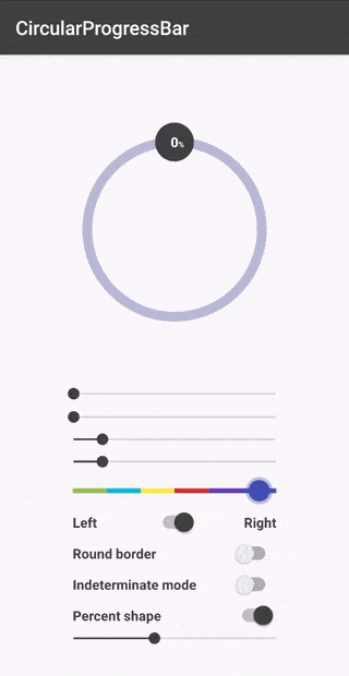
Circular Progress Bar
- Smooth progress animations
- Gradient color support
- Customizable width and colors
- Percent shape overlay
- RTL support
- API 14+ compatibility
The Story Behind CircularProgressBar
Every Android developer eventually needs a progress indicator that isn’t just a boring horizontal bar. I found myself needing a circular progress bar for multiple projects, and the existing solutions were either too complex, poorly documented, or missing features I needed.
So I built my own, and decided to open-source it.
What Makes It Special
The library focuses on simplicity and customization. You can drop it into your project with a single Gradle dependency and have a working circular progress bar in minutes.
implementation 'me.abdelraoufsabri:circularprogressbar:1.1.3'Key Features
Gradient Support - Not just solid colors. You can create smooth gradients from any direction:
circularProgressBar.apply { progressBarColorStart = Color.GRAY progressBarColorEnd = Color.RED progressBarColorDirection = GradientDirection.TOP_TO_BOTTOM}Percent Shape Overlay - Display the current percentage inside the circle with a custom layout:
app:cpb_percent_shape="@layout/custom_layout"app:cpb_percent_text_view_id="@id/number"app:cpb_percent_shape_enabled="true"Smooth Animations - Progress changes animate smoothly:
circularProgressBar.setProgressWithAnimation(65f, 1000) // 1 second animationTechnical Implementation
The library extends View and uses Canvas drawing for rendering. This approach provides:
- Hardware acceleration support
- Minimal memory footprint
- Consistent rendering across API levels
- Full control over the drawing pipeline
The gradient implementation uses SweepGradient and LinearGradient shaders, rotated and positioned to match the progress direction.
Usage
XML Configuration
<me.abdelraoufsabri.circularprogressbar.CircularProgressBar android:id="@+id/circularProgressBar" android:layout_width="wrap_content" android:layout_height="wrap_content" app:cpb_progress="65" app:cpb_progressbar_color="@color/primary" app:cpb_background_progressbar_color="#b6bbd8" app:cpb_progressbar_width="10dp" app:cpb_round_border="true" />Programmatic Control
val circularProgressBar = findViewById<CircularProgressBar>(R.id.circularProgressBar)circularProgressBar.apply {    progress = 65f    progressMax = 100f    roundBorder = true    startAngle = 180f    progressDirection = ProgressDirection.TO_RIGHT}
// Listen for progress changescircularProgressBar.progressChangeListeners.add { progress ->    Log.d("Progress", "Current: $progress")}